New Bourbon Painting
How The Bourbon Series Started
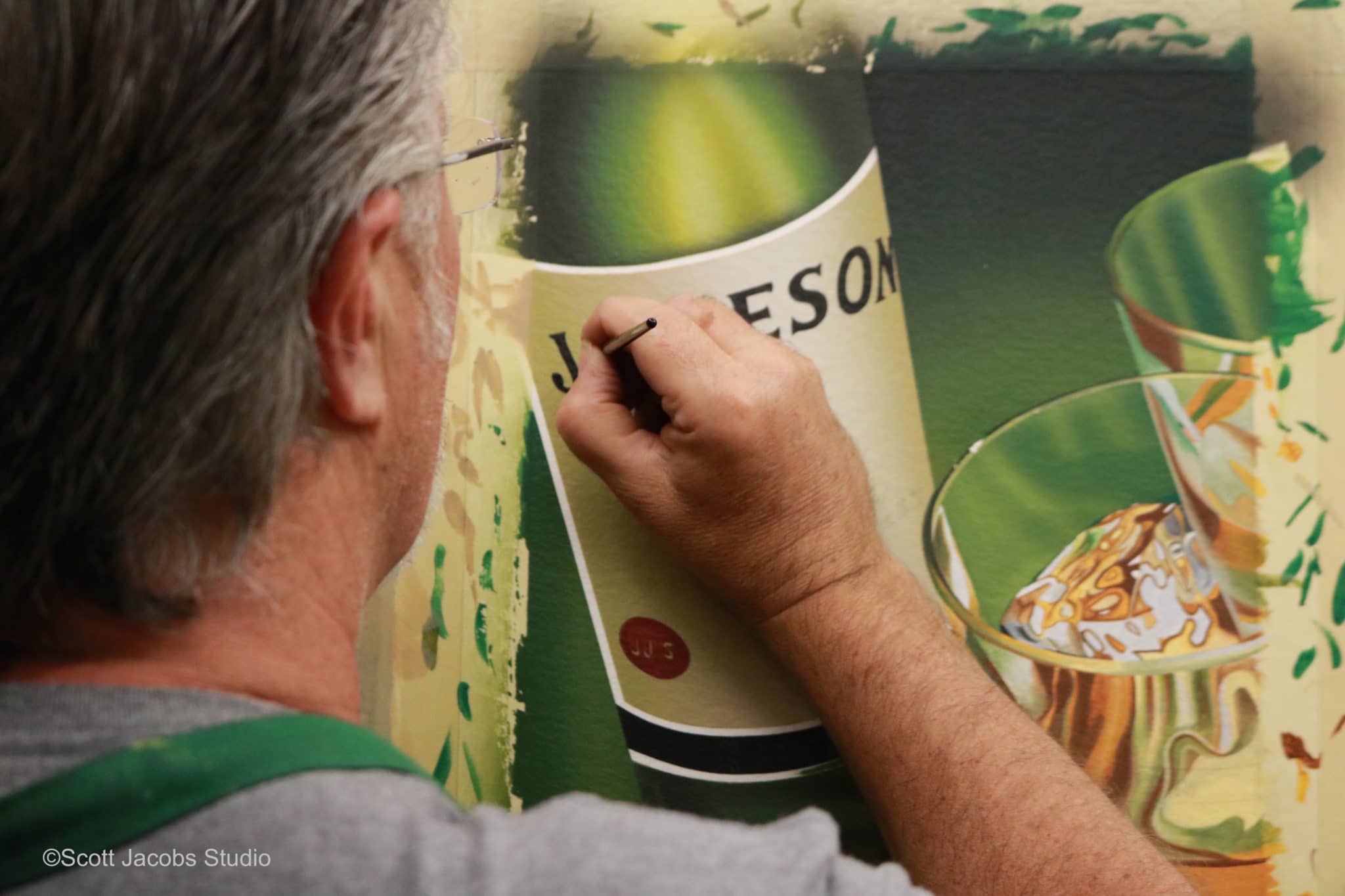
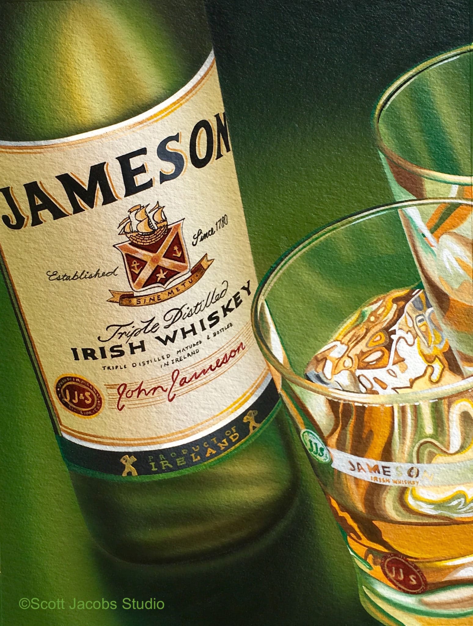
It's been years since Scott's brand specific whiskey paintings first kicked off. It started with a small commission of Jameson that a collector wanted done for his grandson named Jameson.
After completing the original, we released a small edition of 25 numbered prints with 3 AP's and 3 HC's. To our delight, we sold out within a couple weeks!
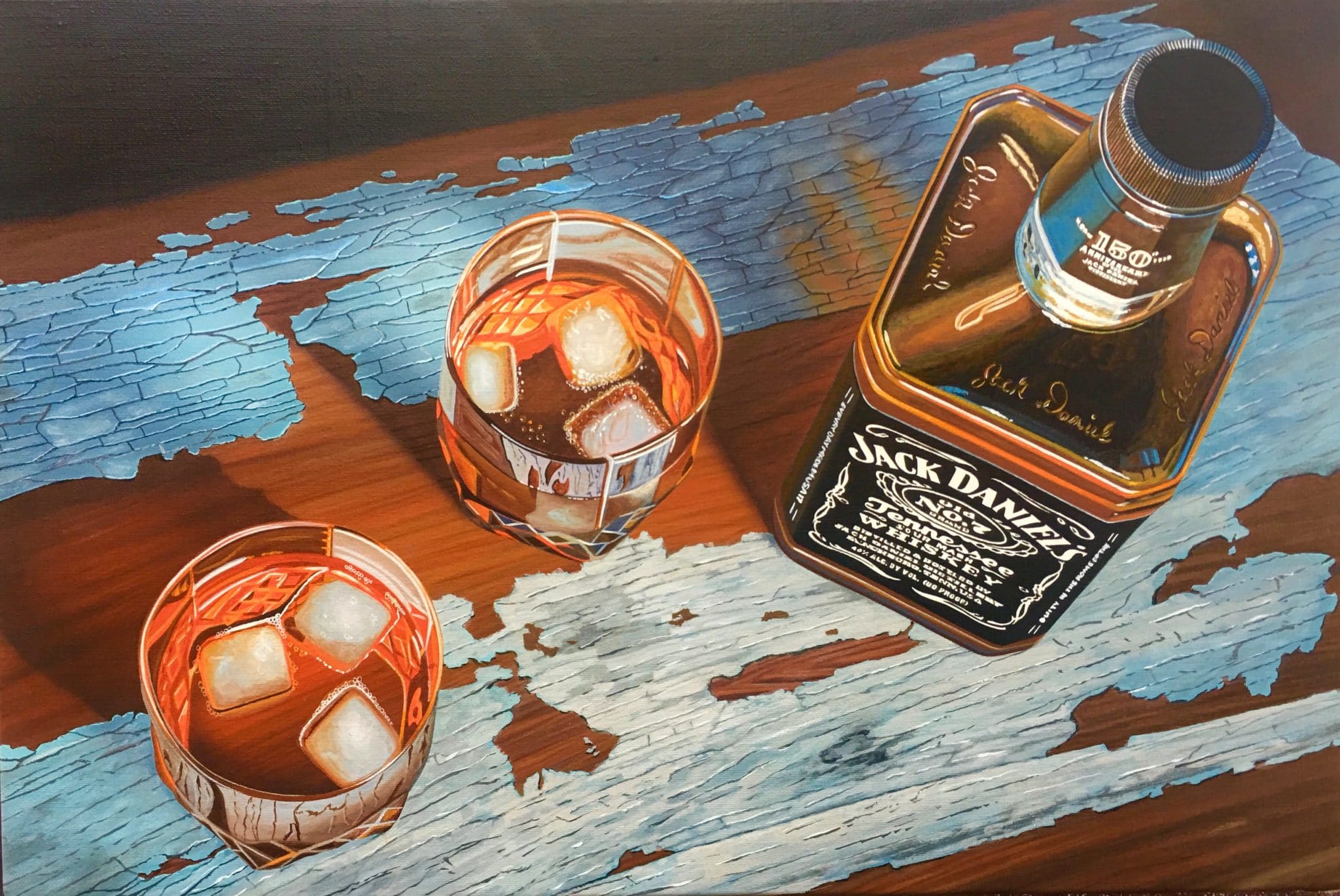
Amber & Ice
After the response we received from Jameson, Scott decided to try a Jack Daniels painting called "Amber & Ice" in October 2017.
We were optimistic about the finished image, but we were not expecting it to sell out in 11 days!
Now In 2021
Since Scott's travel schedule has slowed due to Covid, it allowed him to spend more time in his studio catching up on commissions and messing around with new subjects he doesn't normally have time to explore.
"I've been asked for years to paint a Pappy Van Winkle bottle. With my travel schedule being cancelled for over a year, I've had more freedom to paint what I want. Van Winkle was at the top of my list since I am a big bourbon fan.
What's also cool about this piece is that you can buy the print for less than the cost of an actual bottle!"
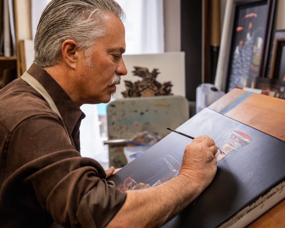
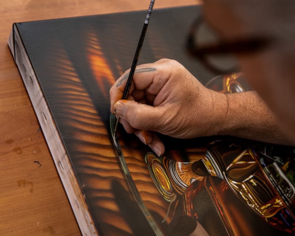
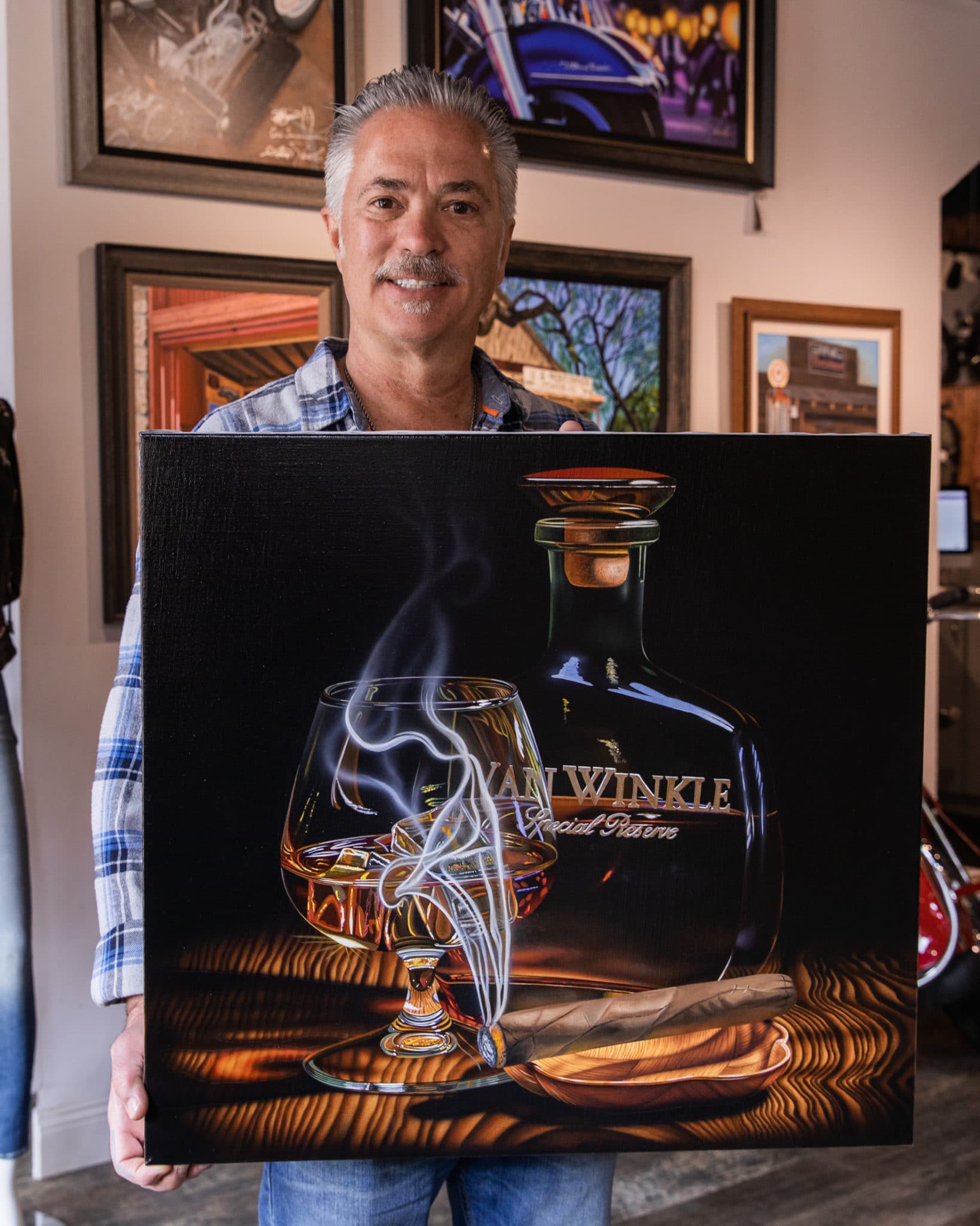
Scott combined the use of acrylic and oil paint on Belgian linen to complete this masterpiece.
Listening to Scott plan where to paint and what paint to use was quite fascinating. Even though I've been in the art world since I was born, I never knew that using two types of paints could require so much planning.
While I was photographing him, he'd say things like, "I have to make sure the area above the cigar is in acrylic so that I can airbrush the smoke in acrylic. I can't paint over oil".
I also know that a righty should start from the left side of the canvas and work their way right, but the two paint types added a whole new level of consideration that I wasn't aware of.
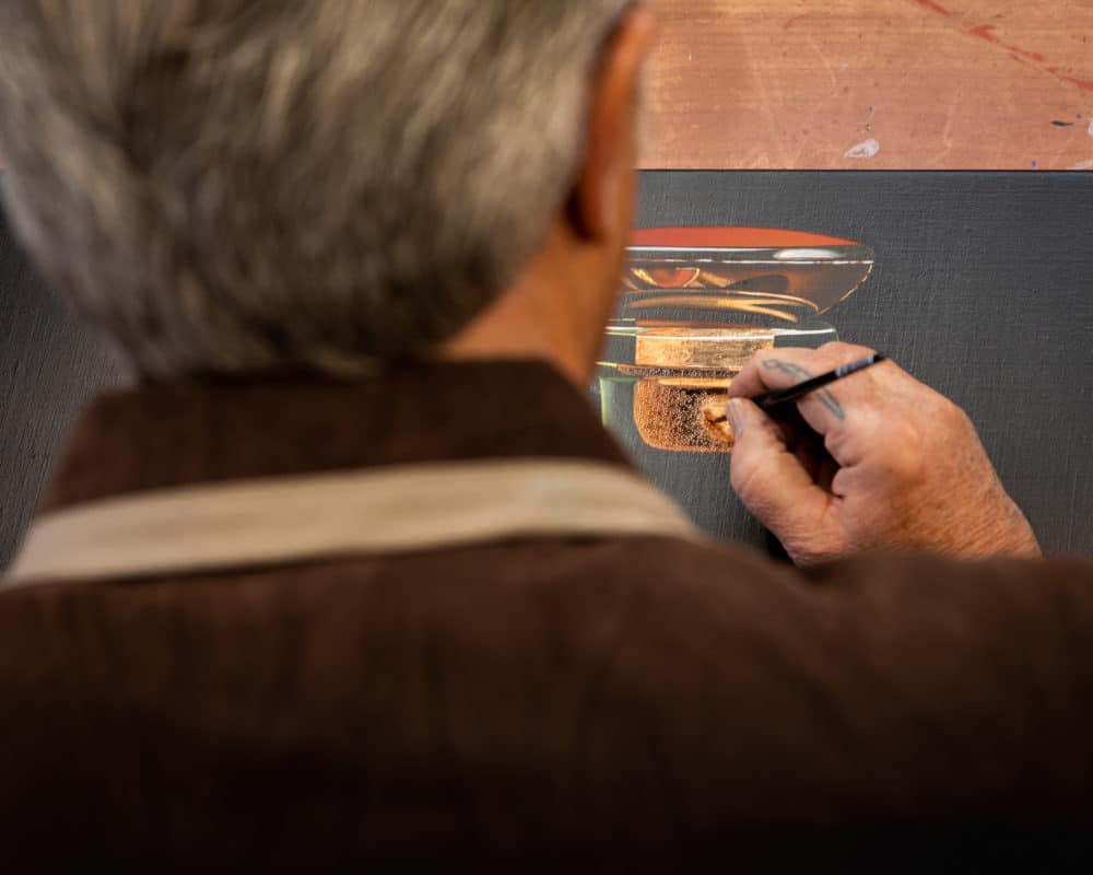
My favorite part of this piece is the top of the decanter. As I've already said, I have grown up watching my dad paint and I know that depicting glass is extremely complex. When done right, it adds a new level of talent and credibility to the artist's portfolio.
I've seen a lot of artists actually remove reflections from their paintings because of how much more time it takes to complete. Scott, on the other hand, leans into the challenge and tackles the detail that's required to maintain his photorealistic talent.
To an untrained eye, the color pallet seems pretty monochromatic, but as your eyes travel throughout the image, the details and variety of colors begin to show up more like in the base of the bourbon glass, the ice cubes inside the drink and the top of the decanter.
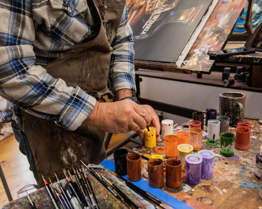
If you look at Scott's paint table, you see an array of yellow, orange, red, and more.
Once the oil paint was dry, it was time to apply Liquin to seal the colors and protect the painting for decades to come.
If you look closely, you can see the difference Liquin makes in the overall color (below).
We couldn't be happier with this masculine, yet elegant, painting to release as our Summer 2021 bourbon painting!
Enjoy!
Olivia




Is the Pappy original sold?
Yes, but Scott can do a commission if you’re interested in something similar!
If you’d like more info, feel free to call the Gallery. 605 559 1876
This is awesome. I have a friend who is “Pappy” lover. Are there any pricing and sizes available if this will be printed?
Hi Lynn, Here is the product page: https://jacobsgalleryshop.com/shop/slow-burn/